
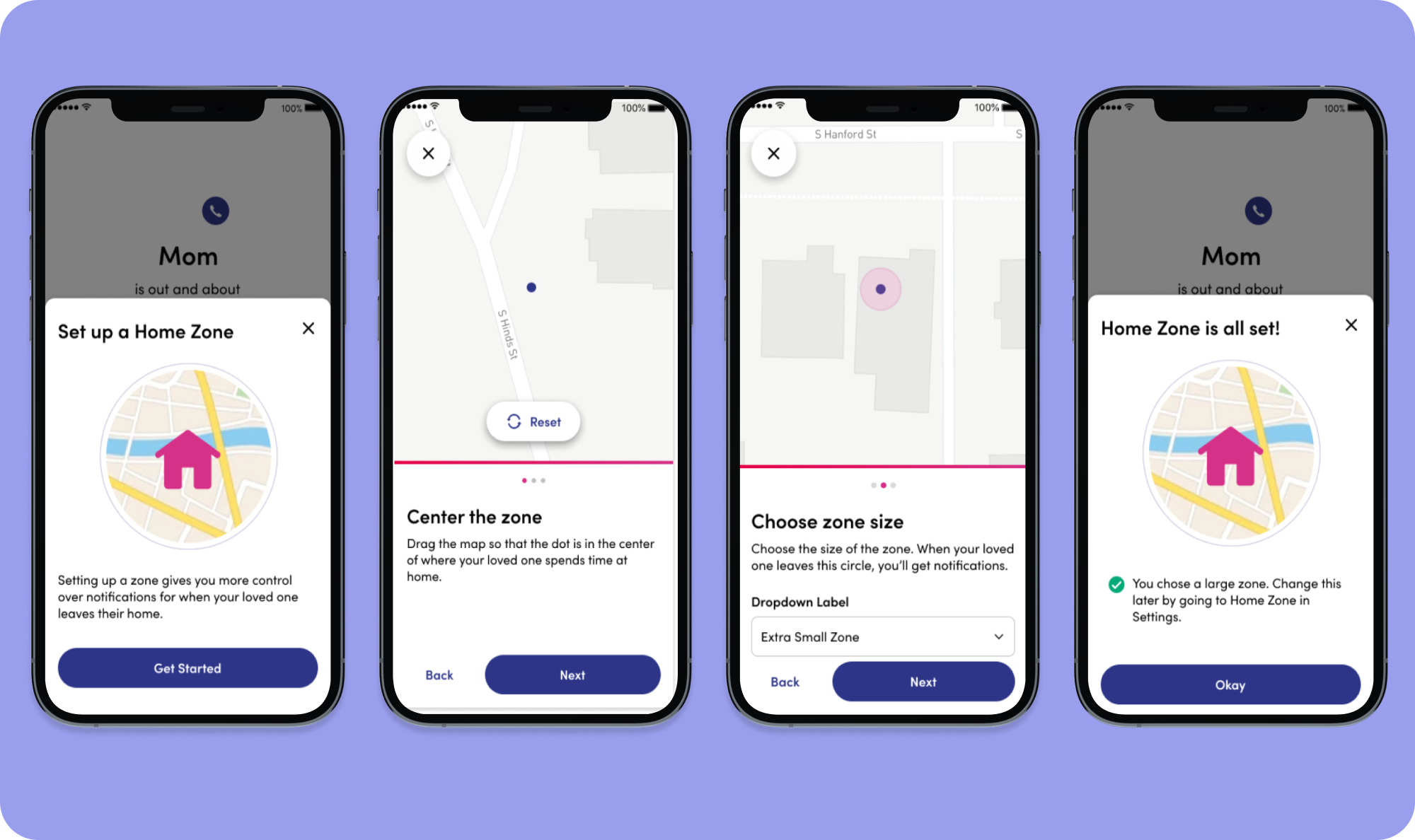
Home Zone
I’m a caregiver to my mom, I don’t want to know when she is out gardening but I do need to know if she made it to her doctors appointment.
Date: March 2021 - Sept 2021 // Company: Best Buy Health // Team: Lively Link Squad // Title: Senior UX Designer
Skills:
User Research, Prototyping, Interface Design, Information Architecture, Analysis, Collaboration, Communication, Design Leadership.
Role:
As a lead designer, I was responsible for end-to-end Link App CX.
Contributors:
1 visual designer
1 offering manager
1 product manager
2 engineering managers + engineerings
2 QA

Overview
Problem
Caregivers received unnecessary stress from automated alerts about their loved ones leaving the house due to the system's inability to customize location settings.
These false alerts, triggered by simple activities like stepping into the yard, eroded trust in the product.
Solution
Allow caregivers to customize the 'home zone' to match the specific living situations of their seniors, be it in nursing homes, large properties, or urban areas. This customization ensures alerts accurately reflect the senior's location. Which gives them confidence in their peace of mind.
Challenges
Challenge One
Identify Root Causes of Dissatisfaction
My business partners knew that Link was poorly rated, but not why. So I initiated a discovery effort.
By highlighting three key issues causing caregiver dissatisfaction, I gained enough trust to influence the roadmap and align on pivoting towards the development of "Home Zone."
Challenge Two
Aligning UX Priorities in a Competitive Landscape.
To ensure our project stood out amid competing organizational goals, I frequently highlighted its UX value to the offering manager. I navigated a limited research environment and regularly presented the insights.
Challenge Four
Navigating Organizational Shifts
As we advanced in the build phase, we faced a reorganization and the sudden departure of crucial stakeholders, including our primary stakeholder and Product Manager. To navigate these changes, I spearheaded communication efforts to bridge gaps and maintain project momentum. By rallying the Design and Product Management teams, we adapted swiftly, ensuring the seamless continuation of "Home Zone" despite these unexpected shifts.
Method
Prioritizing the Problem
With limited means to obtain additional user feedback, I relied heavily on user reviews and other discovery efforts, categorizing the themes into three main buckets:
The information I receive from Link is sometimes inaccurate.
The information I receive from Link isn’t useful to me.
I don’t know how to use the information I receive from Link.
Uncovering Root Causes Through Expert Insights
After many interviews with Subject Matter Experts from sister teams, I uncovered four main root causes of inaccurate location information.
Design and Build
Solution Hypothesis
By giving caregivers the ability to customize the geo-fence cluster, we will decrease negative user reviews around location inaccuracy, thus reducing Link user dissatisfaction and increasing user trust.
Logic Map
I leveraged a logic map, which is a conglomeration of a few different UX tools, for effective collaboration with engineers and structured the project's information architecture, ensuring alignment with user needs. It received a ton of praise and has become a standard part of my design practice.
Landscape Research
Iterations
Developed and refined multiple iterations of the UI, incorporating feedback and best practices to finalize an intuitive interface for seamless location zone adjustments.

Design System Pilot
I persuaded the Product Manager of the advantages of integrating our inaugural design system, dubbed Sunrise, into the Link app, highlighting its potential for enhancing user experience through consistency and scalability.
Collaborating intimately with the visual designer, we crafted components designed for scalability and adaptability. Leveraging human-centered design principles, Sunrise has not only been embraced across various platforms but has also been the focus of numerous demonstrations, showcasing the value and methodology of adopting a design system centered on user needs.
Research Goal
Determine if messaging around Home Zone gives users an accurate understanding of what they are changing.
“The zone she can roam around in before I get an alert of her leaving”
“The Home Zone is a safety bubble for notifications ”
Accessibility
Ensured our designs met accessibility standards, focusing on color contrast, keyboard navigation, and screen reader support to make our product inclusive and usable for all users during the design handoff.
I collaborated with a sister’ org accessibility UX designer. This template was then launched to both Best Buy Health and Best Buy for all UX designers to implement.
Bringing it all Together


Impact
The journey of "Home Zone" is a testament to innovation, resilience, and collaboration. Despite facing significant challenges, including organizational changes and the departure of key stakeholders, we delivered a user-centered solution ready for launch.
The introduction of the first design system, Sunrise, not only streamlined our processes but has also been adopted across various platforms, showcasing its broad impact. This project not only enhanced our team's capabilities in design and development but also marked my growth as a storyteller and facilitator in product innovation.
The success of "Home Zone" expanded my role from focusing on specific platforms to embracing cross-platform responsibilities.
In addition, the annotation template was expanded company wide and later launch to Figma Community to be shared world-wide.